Normaltown Station | Page 2 | Creative Design & Development

Rebel T3i Video Test [Observation]

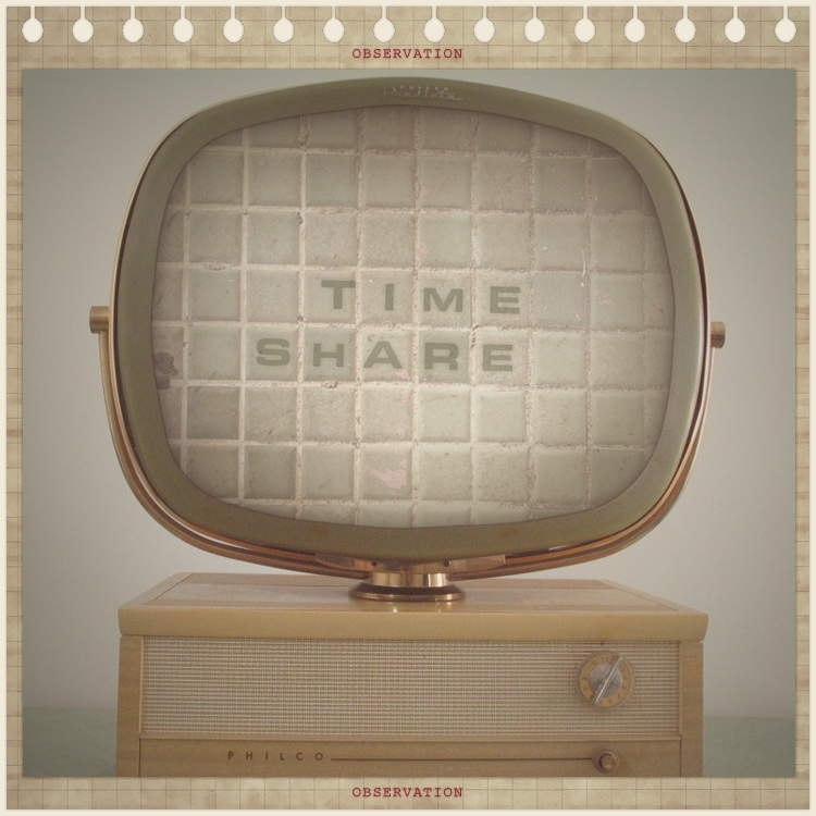
Here is a test of my Canon Rebel T3i’s video capabilities. The editing/filtering was done in an older version of Final Cut Express. The audio was created in Logic Express.

I’m not sure if the camera or the editing software is to blame for the dropped frames. Also, the image quality is less than I had hoped for (jpg noise and halos). I’m thinking/hoping there’s a codec issue between the T3i’s file format and the version of Final Cut Express I’m using.
Bakery Branding

Miche Logo

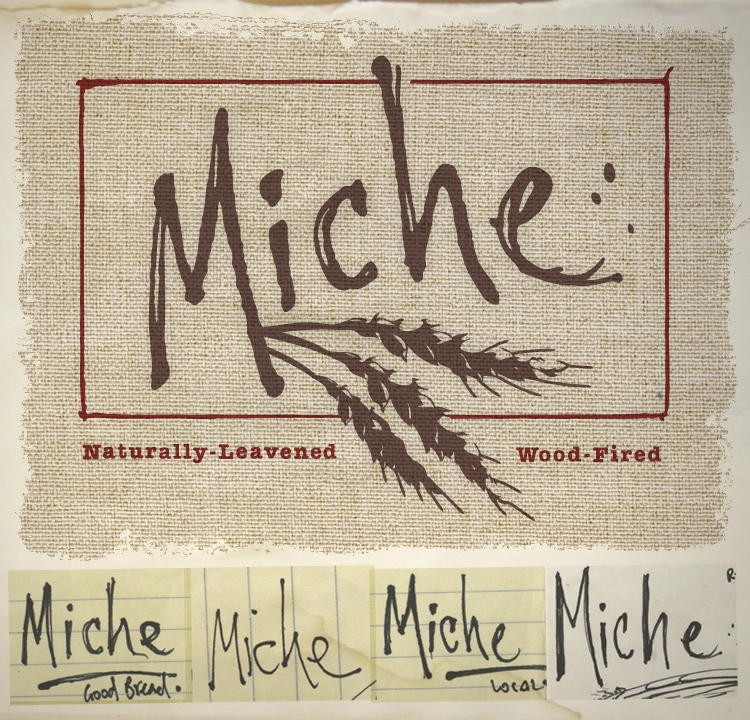
Miche is a small-scale local bakery that came to me for some branding help. I worked with the owner/baker to develop a logo that would communicate handmade craftsmanship. As you can see, the logo text is closely based on his own sketches.

In the final logo, the border acts as a plane from which the wheat is able to break out, creating a sense of movement. The wheat can also be seen as vaguely representing the topography of a wheat field with rolling hills.

The tagline font is a modified American Typewriter Bold.

Miche Bread Banner

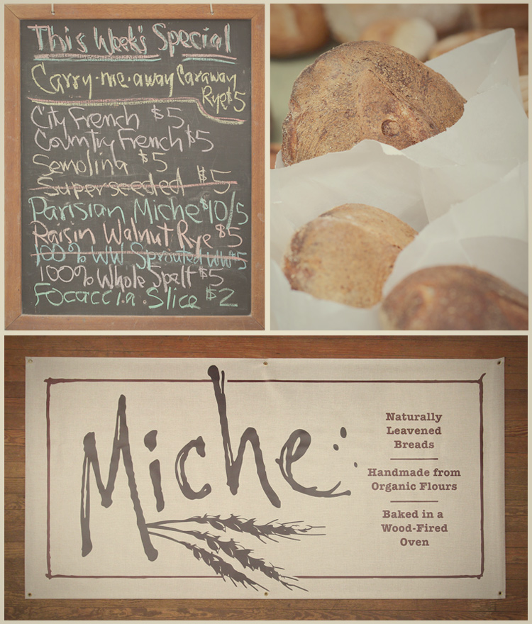
The first use of this logo was on a 3′ x 6′ vinyl banner to be hung behind a sales counter. A canvas texture was printed across the entirety to cover the harsh white of the vinyl substrate. The logo and text were filtered with transparency and “multiply” to let the canvas texture show through, adding to a natural printed-on-canvas feel.

Apparition Detected [Observation]

Happy Halloween

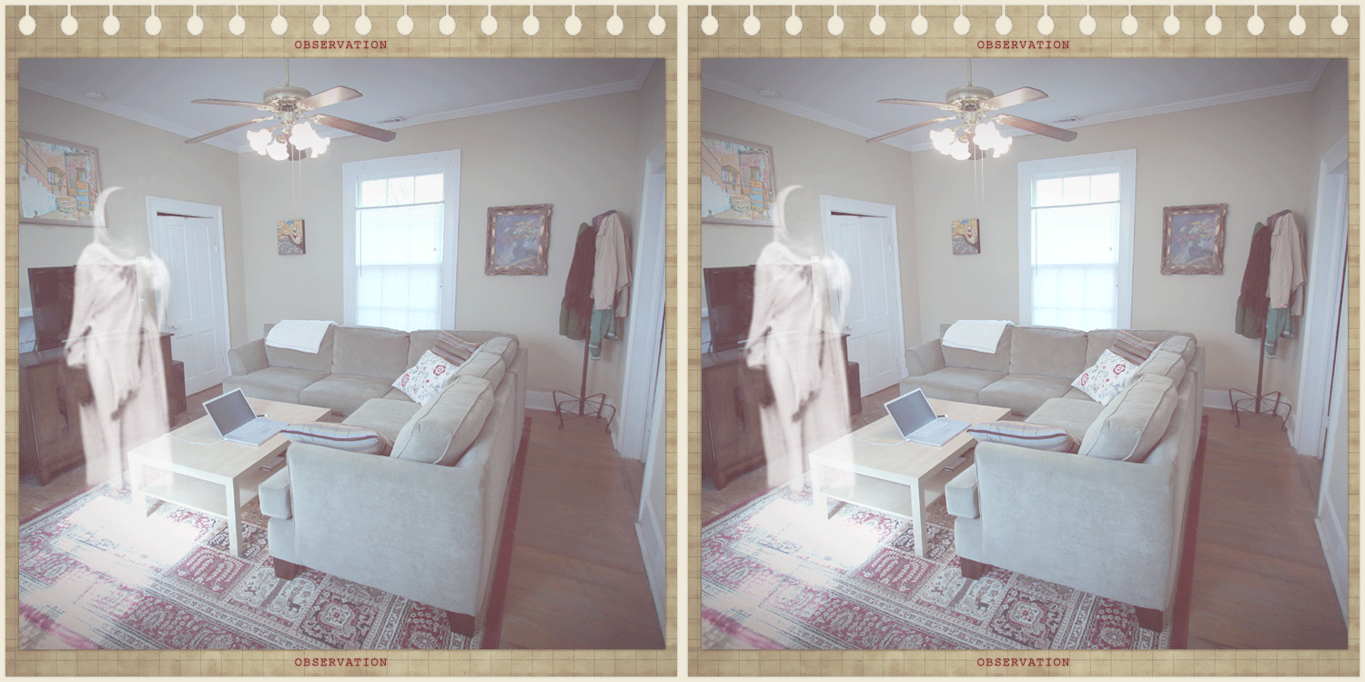
I’m a big fan of those seizure-inducing animated gifs that can give the illusion of 3D. Here’s one I made of my living room. Certain elements in this image only became visible once I added them in through Photoshop.

Happy Halloween!

iPhone 4S Video Camera Test [Observation]

Here’s some test video I shot on my iPhone 4S. Editing and filtering was through Final Cut Express. The audio was constructed through Logic Express.

I think the iPhone’s image stabilization is it’s biggest fault. It’s perfect for when you’re trying to keep the camera stationary, but any panning at all makes for jerky footage. I bet there will soon be an OS update that allows for turning off the stabilization “feature”.

Design by Talia Bromstad [Friendly Station]

Talia Bromstad

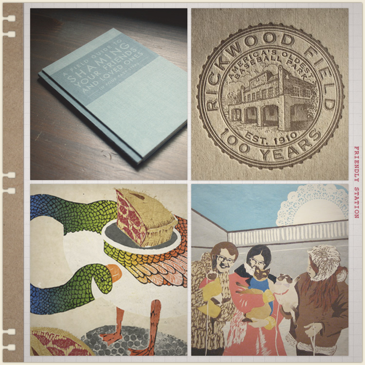
I love Talia Bromstad’s sense of handmade design. She specializes in Book & Graphic Design. Keep her in mind for the next time you need something printed on a letterpress.

Promotion Company Logo Update

Team Clermont Logo update

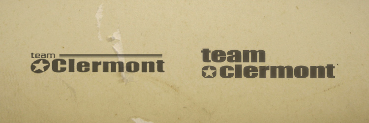
Team Clermont is a radio promotion and publicity agency. As part of designing some shirts and a mailer for them, I updated their logo to strengthen it up a bit.

On the left is their old logo. To the right is the update. I kept the same star theme and font.

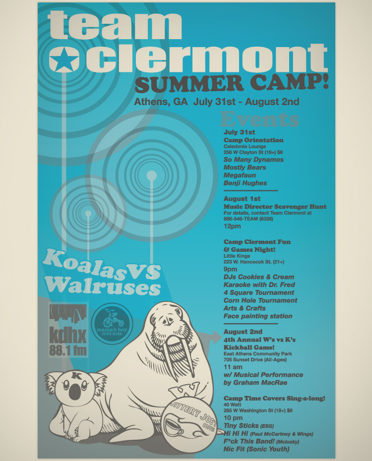
Team Clermont Invite Mailer

The updated logo debuted in this event invite mailer.

Gritty Textures [Observation]

Tile Textures

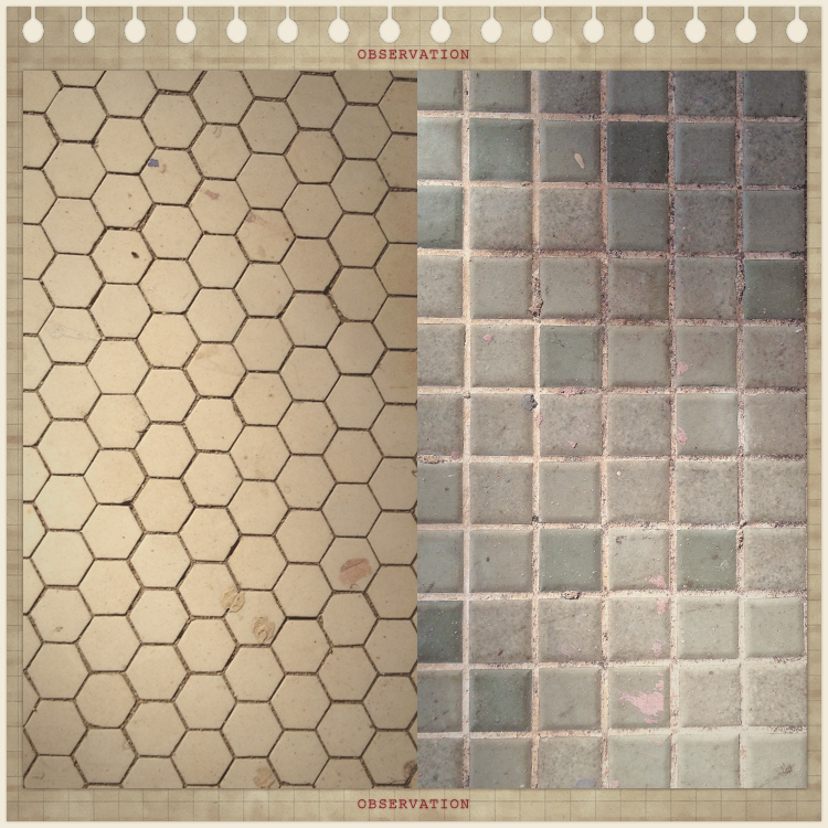
Walking down the sidewalk the other day, I noticed some great tile-work in the entrance ways to a few stores. These two were my favorite. They remind me of the late 60′s, but who knows.

Tile Textures

Tile Textures

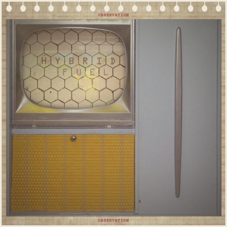
I decided to just play around with them a bit. I also like juxtaposing design elements from different points in time.

Record Label Branding

Athenic Records

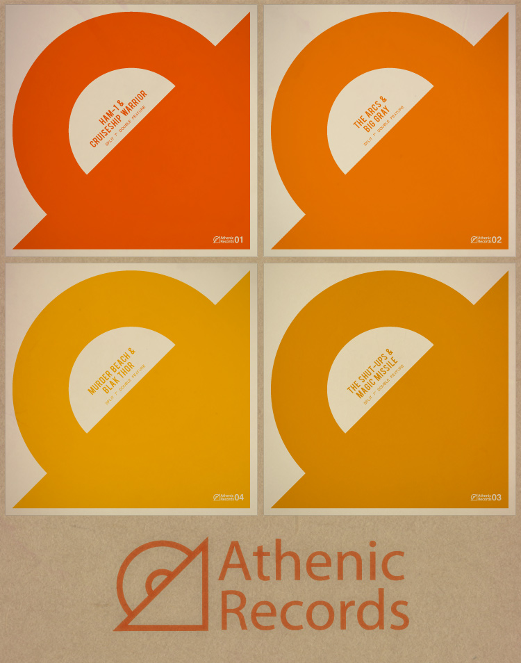
Here’s a logo and packaging concept I developed for a small independent record label. Athenic Records specializes in split 7″ vinyl albums (a different band on each side). The idea is to keep a minimalist and modular feel to the record jackets as their colors shift over time with each successive record release. A completist collector can eventually have the entire spectrum of albums.

Inspiring Signage [Observation]

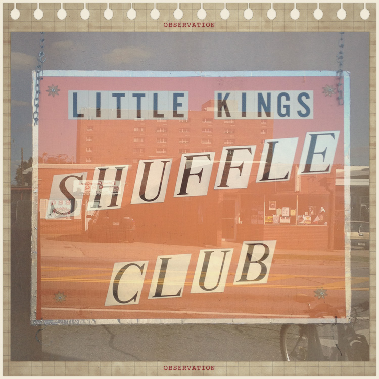
Little Kings Sign

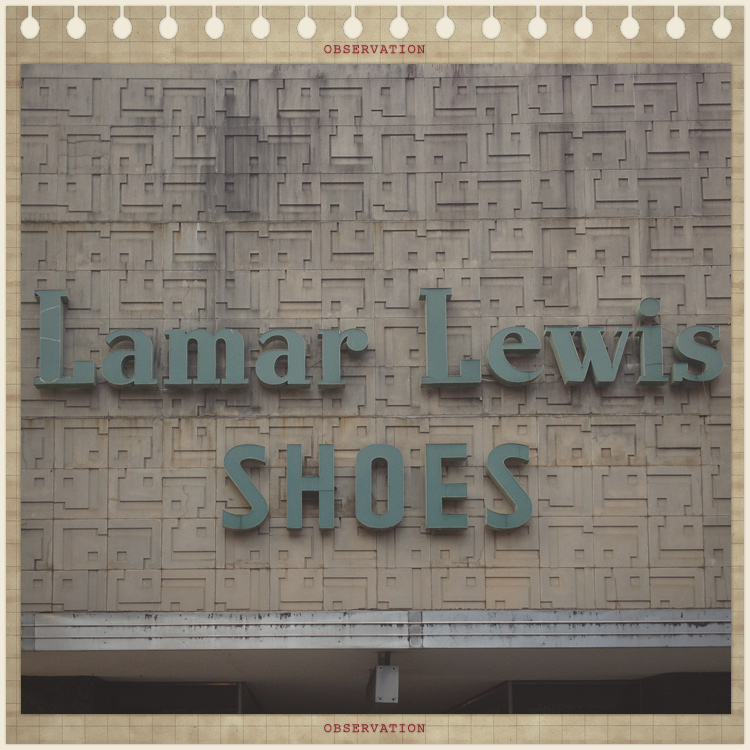
Lamar Lewis Sign

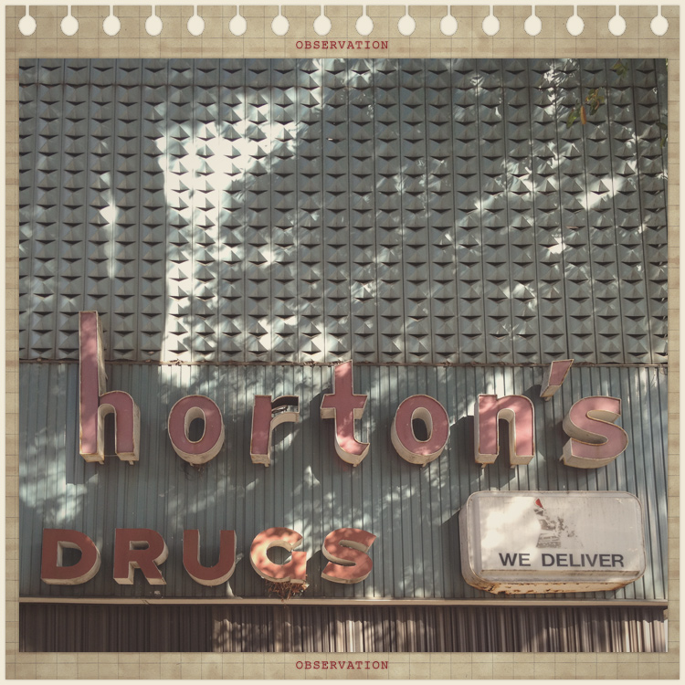
Horton's Drugs Signs

I love the vibe these are giving off. Seen around downtown Athens, Georgia.

Nonprofit Logo Design

TrueCompetition.Org

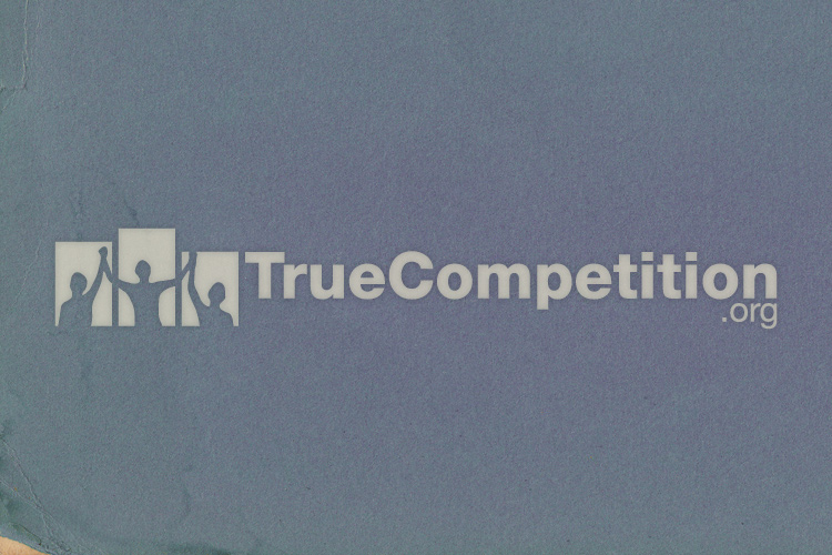
TrueCompetition.Org is an athletics non-profit that believes in “the value of viewing competition as a partnership.” The goal of this logo was to convey the good to be found in unity with one’s competitors.

The vertical bars represent the 1st, 2nd & 3rd place medal podiums on which the figures are meant to be. The crisp modern look communicates a compatibility and relevance with modern sports.