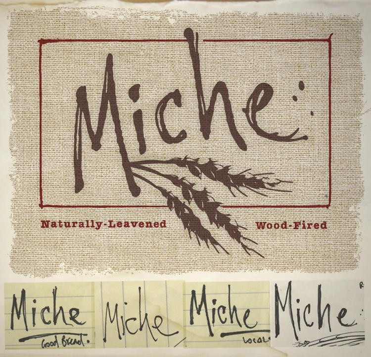
Miche is a small-scale local bakery that came to me for some branding help. I worked with the owner/baker to develop a logo that would communicate handmade craftsmanship. As you can see, the logo text is closely based on his own sketches.
In the final logo, the border acts as a plane from which the wheat is able to break out, creating a sense of movement. The wheat can also be seen as vaguely representing the topography of a wheat field with rolling hills.
The tagline font is a modified American Typewriter Bold.

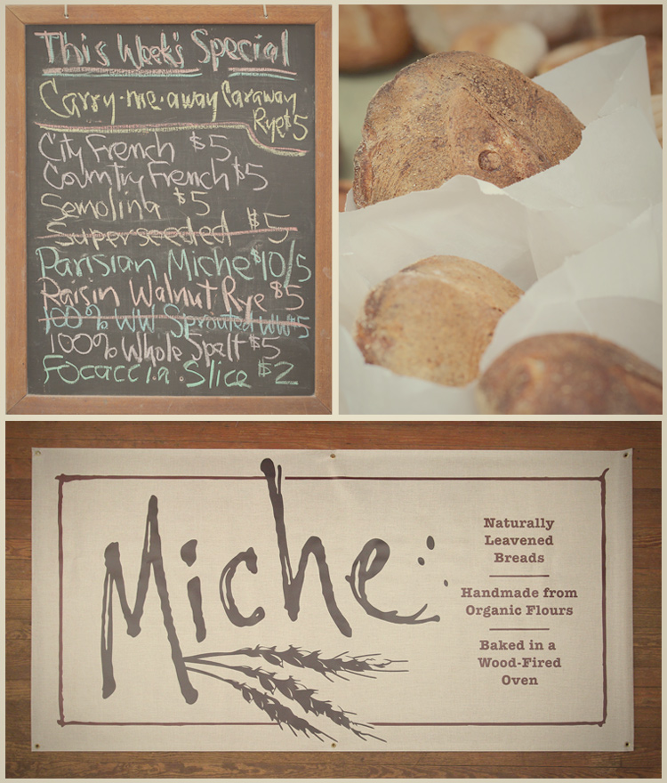
The first use of this logo was on a 3′ x 6′ vinyl banner to be hung behind a sales counter. A canvas texture was printed across the entirety to cover the harsh white of the vinyl substrate. The logo and text were filtered with transparency and “multiply” to let the canvas texture show through, adding to a natural printed-on-canvas feel.


