Category Archive for: Station Projects | Normaltown Station

Promotion Company Logo Update

Team Clermont Logo update

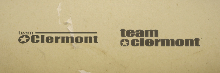
Team Clermont is a radio promotion and publicity agency. As part of designing some shirts and a mailer for them, I updated their logo to strengthen it up a bit.

On the left is their old logo. To the right is the update. I kept the same star theme and font.

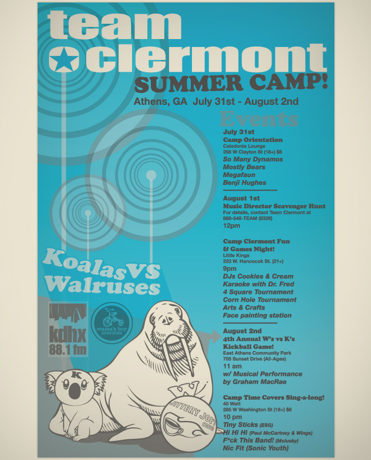
Team Clermont Invite Mailer

The updated logo debuted in this event invite mailer.

Record Label Branding

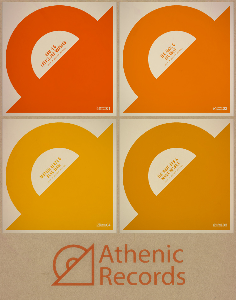
Athenic Records

Here’s a logo and packaging concept I developed for a small independent record label. Athenic Records specializes in split 7″ vinyl albums (a different band on each side). The idea is to keep a minimalist and modular feel to the record jackets as their colors shift over time with each successive record release. A completist collector can eventually have the entire spectrum of albums.

Nonprofit Logo Design

TrueCompetition.Org

TrueCompetition.Org is an athletics non-profit that believes in “the value of viewing competition as a partnership.” The goal of this logo was to convey the good to be found in unity with one’s competitors.

The vertical bars represent the 1st, 2nd & 3rd place medal podiums on which the figures are meant to be. The crisp modern look communicates a compatibility and relevance with modern sports.

Decorative Raised Box Garden

Decorative Raised Box Garden

Decorative Raised Box Garden

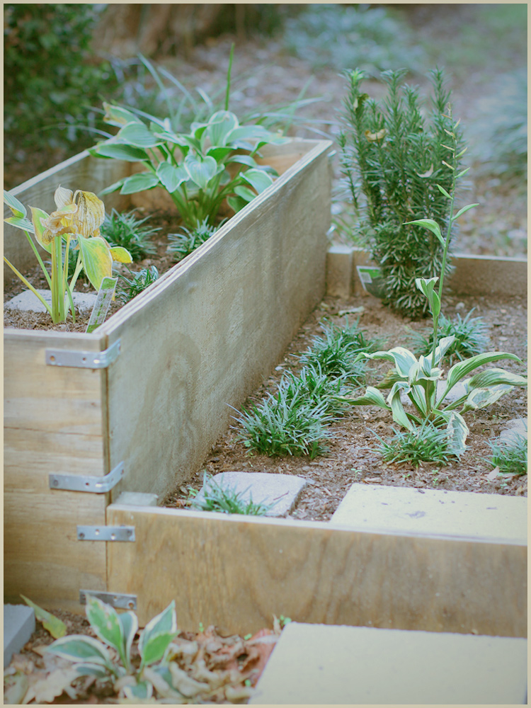
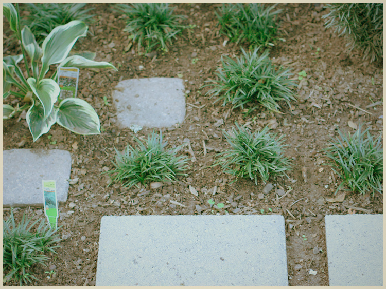
Normaltown Station’s backyard needed a little work. I decided to add a decorative raised box garden in one corner. Horticultural design isn’t something I’d ever really gotten into before, but I gave it a try.

I thought a tightly-gridded geometric layout would compliment the rectangular boxes. Also, I’ve been playing a lot of Minecraft lately, which might have contributed to the linear theme.

I started a little late in the season – about three weeks ago. Hopefully the hostas will root well enough to make it through the winter. The plan is to prune the yew pine at the end of winter to keep it as a shorter shaped bush. The dwarf mondo grass is expected to eventually fill in to bring out a nice contrast to the paving stones.

Expect an update in the spring.

Band Logos

Band Logos

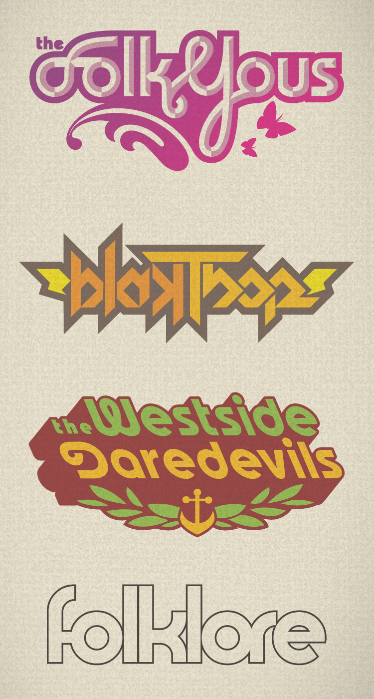
Here are some of the band logos I’ve worked on over the past few years. (from top to bottom) The Folk Yous, Blak Thor, The Westside Daredevils, Folklore.

Kickball Uniform

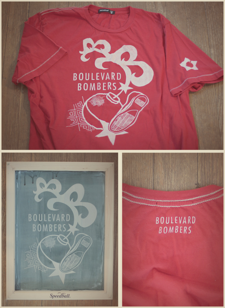
Boulevard Bomber Shirts

The Boulevard Bombers, a local kickball team, needed a uniform. I handled the logo development and shirt design as well as the actual screen printing. It was a short run of 14 shirts, so it made sense to do it in-house.

The design is meant to harken back to the mid 1960s, perhaps a more classic era of kickball.

Athfest 2011 Show Poster

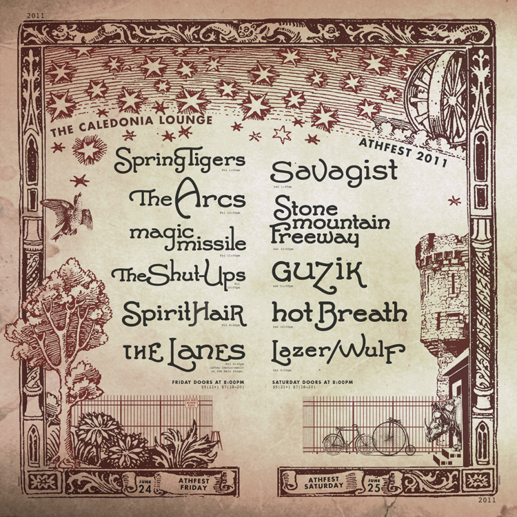
Athfest 2011 Caledonia Poster

Athefest is Athens, Georgia’s largest music and arts festival. I’ve been doing various projects associated with Athfest since 2003, mostly t-shirt designs and show posters.

This year I put together the show poster for the Athfest weekend events at The Caledonia Lounge. The woodcut style works with the differing vibes of the two different nights of music. In my opinion, the first night of bands was a bit more organic and natural, while the second night’s bands were harder and a bit more mechanical.

The overall theme of the layout is based on the physical location of the venue. The fence, courtyard, trees, bikes, and buildings are all where you might expect to find them if you visit the place. The Friday night column is with the trees on the nature side, while the Saturday night column is the bikes and buildings (the man-made side).

Each poster was digitally printed on two corresponding pieces of 11″x17″ off-white cover-stock, trimmed and hung together as one 17″x17″ piece. The poster was also digitally prepared as a jpg for emailing and social media (shown above).